Showing posts with label blue. Show all posts

Cocoa Vanilla Studio: Our Happy Story


Hi Creative Friends! 

Welcome back for more memory keeping inspiration! 
Today I'm sharing my take on the Cocoa Vanilla Studio multi photo theme week;
using our delightful new Midnight collection. 
I just love the blue hues and indigo in this collection - so beautiful! 
Needless to say, I just had to create a monochromatic page with it all! 
But enough chatter, here's my layout with more than one photograph......

"Our Happy Story"


*Sigh!* Oh-so-beautiful!
And what a happy story this is! 
All our Christmas wishes have come early this year with the arrival of our new miniature dachshund puppy! Yay!!! All the feels for this happy moment! 
And don't those CV-MN007 INKY DEPTHS blues make it even more lovely?! There are just SO many beautiful creative possibilities with the Midnight collection!

My layout begins with gluing one inch paper strips of pattern paper, CV-MN01 BLOOM & GROW (reverse side), on both sides of the white cardstock base. I then apply lots of inky blue splatters and droplets to the white cardstock base. Next, I remove the large die cut from CV-MN018 LARGE DIE CUT & BACKING KIT, and snip it in half. I back this half die with my favourite paper, CV-MN007 INKY DEPTHS & foam mount it to the top center of my layout design. Awesome!

To this fabulous die cut feature, I layer my super adorable puppy pictures....


You'll spot DIE CUT EPHEMERA frames beneath both my photographs, as well as an INKY DEPTHS layer from the 6x8 PAPER PAD. I foam mount the over hanging edges, and tuck the blue watercolor wash CLEAR STICKERS beneath my photos too! 
I embellish my multi photo cluster with DIE CUT EPHEMERA, & an ACCESSORY STICKER or two.....


I use the CARDSTOCK TITLES to form my title, Our Happy Story, which I layer over my photos as well. I love the midnight blues, and this title just enhances my monochromatic look! I add subtle journaling around the photos with those gorgeous sentiment stickers from the ACCESSORY STICKER sheet. Perfect! 
Here's another view for you......


So much gorgeousness! 
Who would've known that blue is my favourite colour?!! 
And seriously, how cute is our new addition? We've called him Maxwell, and he is just as divine in nature, as he is in appearance - puppy LOVE!!!

Moving down the page, you'll spy more inky splatters, CLEAR STICKERS, ACCESSORY STICKERS & even a CHIPBOARD PIECES mason jar filled with hearts....


Oh my heart!!! Could it get any sweeter than this?!!
I'm loving the CLEAR STICKERS in the Midnight collection - so versatile & the quality is amazing! Those navy crosses are so effective that they don't even look like stickers - incredible!!!


The sweetest thing, indeed!
The mason jars filled with hearts are the perfect ending to this happy story - all the love for little Maxwell the Miniature Dachshund! To bring even more attention to the CHIPBOARD PIECES one, I've foam mounted the DIE CUT EPHEMERA heart onto it. I've also tucked in a couple stickers beneath it, as well as that directional arrow from the CLEAR STICKERS.


Such a happy moment, beautifully documented with the Cocoa Vanilla Studio Midnight collection!
I hope you've enjoyed seeing my take on the multi photo theme 
& that my layout has inspired you to get creating too!

Thanks so much for visiting today,
til next time, 

Happy Arty Days, 
Amanda xo

Cocoa Vanilla Studio: Bohemian Dream: Remember


Hi Creative Friends!

Time for another Cocoa Vanilla Studio post,
&  I am SO excited to be sharing my take on pink OR blue theme week!
Both of these colours are divine - but one of them is my all time favourite!
I am still swooning over the beautiful Bohemian Dream collection, and just had to use it for today's layout.
It's just so dreamy and divine!

Here's what I've created,
"Remember"


Oh isn't this pretty?!!!
And no surprises, I chose to use blue for my layout! Did you know it's my favourite colour? lol!
There are a couple gorgeous hues of blue in the Bohemian Dream collection,
& I decided to feature both of them in this sweet page.
There's that delicate, pastel aqua, as well as that super pretty royal blue.

My layout begins with that sensational stripe pattern, CV-BD005 DREAMER.

I just adore this shade of blue, and with it's watercolour appearance - well, let's just say it's a sure favourite of mine! LOVE it!
To really draw your eye into my page, I use a central focal point design for my photograph.
The VELLUM & DIE CUT EPHEMERA wreath also serves as a border for my sweet layered photo! And those layers! Well, aren't they something?!
That's exactly why I LOVE the new 6 x 6 PAPER PAD - it has so many uses and is perfect for layering!
Let's take a closer look....

That wreath is SO pretty!
I've combined those incredible watercolour leaves and intricate butterflies from both the DIE CUT EPHEMERA & VELLUM ACCENTS packs, as well as those sweet ENAMEL SHAPES.
Being selective to only use those with blue tones.
To further establish the love of blue, I have also added a very soft and delicate mixed media base within the wreath.
It's a combination of Shimmerz PaintsVibez: Jeni Be Bleu, Inklingz: Me & Blue, &
Creameez: Sky's The Limit. So so pretty!!!
The 11 inch square white cardstock base really emphasises the colours and again, draws you into my layout.
I have used a black and white photo for my layout because it lends itself to the colour palette beautifully.  And just how divine is that photograph?
I have double framed it to really focus in on that sweet moment.....

Beautiful, indeed!
My photo is layered onto a few of the blue patterned 6 x 6 PAPER PAD papers, and then framed with the distressed timber frame DIE CUT, which I then double up on with matching CHIPBOARD ACCENT STICKER frame.
The frames also mimic the jetty and shapes formed within my photograph. Everything so carefully positioned, to create a sense of unity within the design.
The frame is then embellished with an ENAMEL SHAPE, DIE CUT sentiment & another CHIPBOARD ACCENT STICKER. Central to it all is that gorgeous layered butterfly. It's another of those fabulous CHIPBOARD ACCENT STICKERS with a DIE CUT simply added over the top of it! Such a simple idea, but adding such dimension!


You'll then spot that incredible CHIPBOARD TITLE STICKER, 'Remember'.
I love that these chippies are bare, and can be hand coloured to suit your needs. I gave mine the blue treatment with some of the Shimmerz Paints I used to create that soft background with. I also dove into my stash and used a butterfly punch to cut out a few tiny cardstock butterflies. One is positioned beneath the edge of my title and the others within my wreath design. They just help to break up all the blue, and add a lil interest.


For finishing touches, more ENAMEL SHAPES, a lil cotton floss thread & that FLAIR BUTTON. Who doesn't love a good flair?!
And at Cocoa Vanilla Studio, the flairs are always so beautifully coordinated and designed with the collection in mind.
Absolute perfection!
And there you have it!

Sweet. Simple. Understated.
But oh so Beautiful!!!

Hope you feel inspired to seek out the blue (or even the pink) tones in your Bohemian Dream stash!
Need more Bohemian Dream?
Visit our online store HERE before it's all sold out!

Need those Shimmerz Paints? 
Visit the online store HERE &
REMEMBER: Place my name in the comments section of your order to receive a FREE gift! Yay!

Thanks so much for stopping by today!
til next time,

Happy Arty Days,
Amanda xo

Pinkfresh Studio: All About the Blues!!!


Hi Everyone!

I am super excited to be inspiring you all to use the blues in the latest Pinkfresh Studio collections! Whether it's the whimsical Escape The Ordinary, or the edgy Boys Fort collection Pinkfresh Studio has a blue for every occasion ;)
Did I mention that blue is my favourite colour? LOL.
I am always inspired by the varieties of blues in collections & how I can incorporate them into different color schemes and designs.
But enough chatter, let's start with something  very girly and pretty....
"Doer. Dreamer. Believer"
Oh swoon!!!
Isn't this the prettiest?!!!
As soon as I saw the gorgeous pattern paper, WANDER, I knew I had to make a feature of it! The diagonal design is such a striking one, and layering that diagonal paper edge with my sweet photograph and those LAYERED TAGS balanced it perfectly! Speaking of balance, this blue needed a little warmth to it - so I introduced the peachy pink tones and gold foil embellishments for added impact. 
The mixed media element really adds that wow factor, and supports this pretty color palette.
I have used the stunning Shimmerz Paints: Paste-eez in Peach Fuzz and applied it over a mandala stencil. Before removing the stencil, I also added a light spritz of Vibez in Pop Art Pink for a little more interest. Those stunning blue ink droplets are Shimmerz Paints: Spritz in Blue Sapphire - so pretty! As it is a feminine page, I have also featured the STITCHED HEARTS, and embellishments featuring butterflies & blooms! So girly and gorgeous!
Let's take a closer look......
Aren't those PUFFY STICKERS just divine?!! I love the watercolor prints, and the matte finish adds a level of sophistication to them. Very cool! 
The gold foil accents on both the LAYERED TAGS and GOLDEN FOILED WOOD ALPHAS continue that 'classy' feel as they add a grown up approach to bling. The tag with the XO inspired my use of the alphas, and added another layer to my design process.
The PHRASE STICKERS were totally on point when it came it adding sentiments to my layout, and described my Miss perfectly!
Those tags are so awesome! I originally intended to use them for card making, but they're just so good that I had to make a feature of them on this layout! La la LOVE them! And to think, all this inspiration and intention from one beautiful blue patterned paper! Loving the blues in Escape The Ordinary!
My next 'blue' layout is with the masucline Boys Fort collection,
"Hero"
How grungy and bold is this cool kid layout?!!
An entirely different look and feel to the previous layout, and yet still drawing on blue! 
This time, my layout design was inspired by the awesome FABRIC PENNANTS. Such a cool embellishment, and coordinating perfectly with my photo direction & the triangle designs in Boys Fort too! 
I rotated pattern paper THUMBS UP so that the triangles were all aligned, and resembled arrows to direct your eye across my page. There were coordinating triangle DIE CUTS that I also added to support this look. 
I mounted my photograph on layers of 6 x 6 PAPER PACK papers, and again drew on both shades of blues and triangles. To add more 'edge' and masculinity to my layout, I created the mixed media background, using texture & bold brush strokes that also travel across the page. 
Instead of gesso, I have used Shimmerz Paints: Acri-Tonez: 3 Sheets 2 The Wind and applied it with a palette knife. Once dry, I painted those gorgeous brush strokes with Spritz: Sapphire (yes, I think this Shimmerz Paints colour may be a new fave of mine!)
Here's a closer look for you.....
So cool!
Lots of awesome embellishments here too - the SCREEN PRINTED WOOD STICKERS are a new favourite of mine! And they compliment the WOOD BUTTON STICKERS so well! I also featured my lil boy's initial in the MINI ALPHA STICKERS for extra fun! Speaking of sticker fun, how about those masculine PHRASE STICKERS?!! These stickers are so bold and strong, and just perfect for any boy or man in your life!
Let's hear it for the Boys!
This collection is really striking and packs a punch! LOVE it for my cool boy!
And there you have it! 
Two very different collections, two very different looks but both featuring beautiful blues!
I hope both my layouts have inspired you today!

Thanks so much for stopping by, 
til next time, 
Happy Arty Days, 
Amanda xo 

Paper Issues: May Pinspire Me


Hi Creative Friends!

Welcome back for more Paper Issues fun with the May edition of 

 - Pinspire Me - 

Here's the  fabulous mood board that we're being inspired by....


Isn't this gorgeous?! All those blues and greens!
 The colours drew me in instantly! 
Here's what I created, 

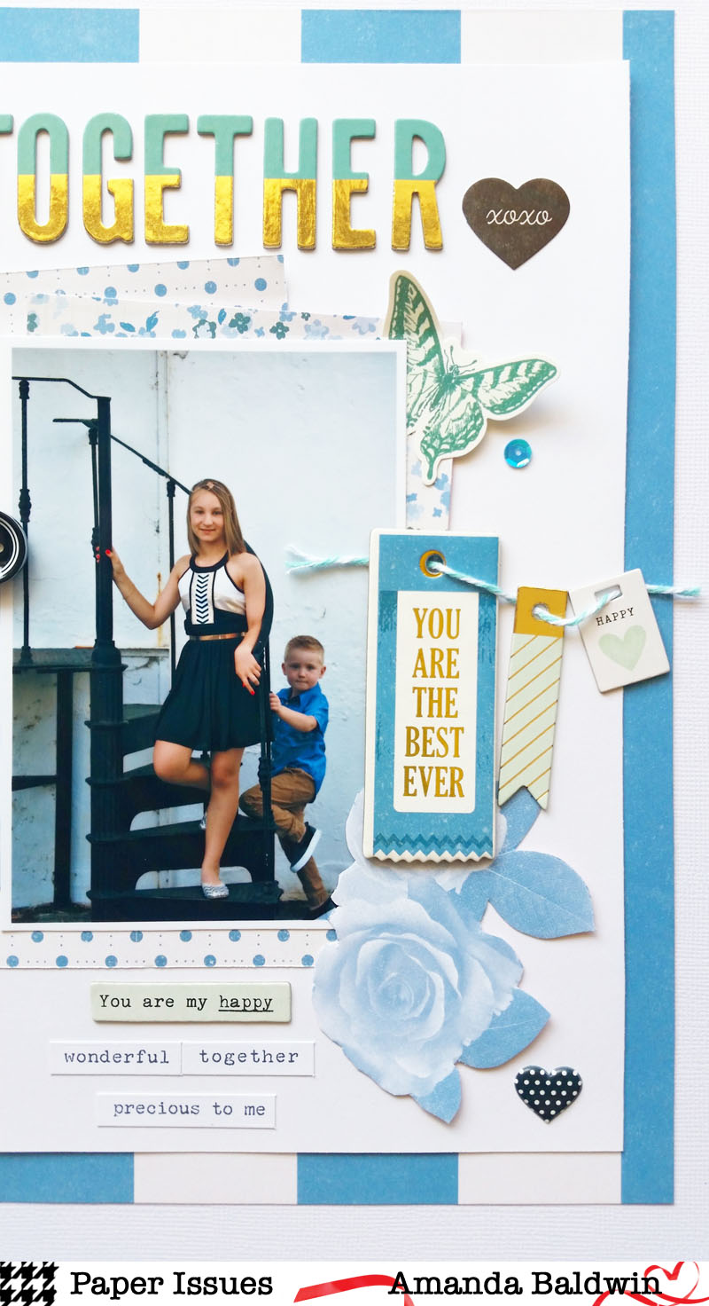
"Together"


You are my happy , indeed!!!
Love this photo of them both together! 
All dressed up for a special event; they both look so grown up! I really wish I could hit the pause button! Love them so!
I used the super pretty Maggie Holmes: Chasing Dreams collection, as well as a few accessory stickers from Cocoa Vanilla Studio. 
I wanted to create an 8.5" x 11" layout look, but still in the 12 x 12" album size for this layout.
That blue pinstripe pattern paper is so pretty!!!
Here's a few close ups.....


How fabulous are those Thickers?!! Love the gold foil accent on them!


The tiny chipboard tags are a sweet embellishment too!


Fussy cut roses are a lovely addition to this layout!
So very pretty!

I hope my layout inspired you &  has you wanting to play along!
Need supplies before you play?
& REMEMBER: Use my code AMANDA to save 20% off too!


Looking for more inspiration?
See what the rest of our amazing team created has created here

Thankyou for visiting!
til next time, 

Happy Arty Days, 
Amanda xo