Hi Friends!
Welcome back for more Pinkfresh Studio: Live More inspiration!
Today I have two very different, but both very feminine, layouts to share with you.
One is quite dreamy and soft, the other very fun, fresh & contemporary!But enough of the chatter, let's get straight into it!
Here's my first layout using that STUNNING marble pattern paper, "Embrace"...."DREAM GIRL"

Oh how delicate and divine is this?!! Needless to say that this is the soft and dreamy page. Just perfect for my precious daughter in the photograph! I love all the layers and details, so much pretty going on here! From fussy cutting, to mixed media this layout has it all! I've been inspired by the gorgeous marble pattern, and the pink, mint and copper tones in this collection. And that "Journey" Foiled Vellum is just aaahmazing!She truly is my Dream Girl & what better way to highlight it than with those beautiful copper Puffy Alphabet Stickers - just stunning!!!Here's a closer look at my layout....
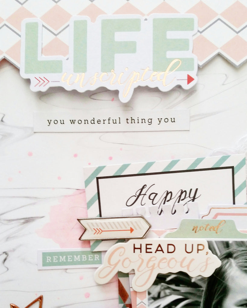
Love the embellishment cluster on the top left corner of my photo! You'll spy pretty Foiled Die Cuts, Foiled Chipboard Stickers, and that awesome Paperclip too! The Happy sentiment has actually been cut out from the journal cards paper, "Rise". Speaking of cutting, who could resist fussy cutting the reverse side of the "Rise" paper?!! I just adore that pink and grey diamond pattern - so very pretty!!!

The Foiled Die Cuts are so FANCY, indeed! This line is very sophisticated! Copper foil is so on trend right now! Love it!!!To matte my photograph, I used more of that divine Vellum, as well as the 6 x 6 Paper pad size of the Rise pattern paper. Gorgeous! How cute are the Acetate Alphas & Studio Puff Stickers?! So much fun! To complete my layout, I added a little cotton floss, and some very soft watercolour media too! Beautiful!I love how this layout turned out! So very pretty!!!
Now for something totally different!Here's my second layout using the stunning LIVE MORE collection, "LOVE"

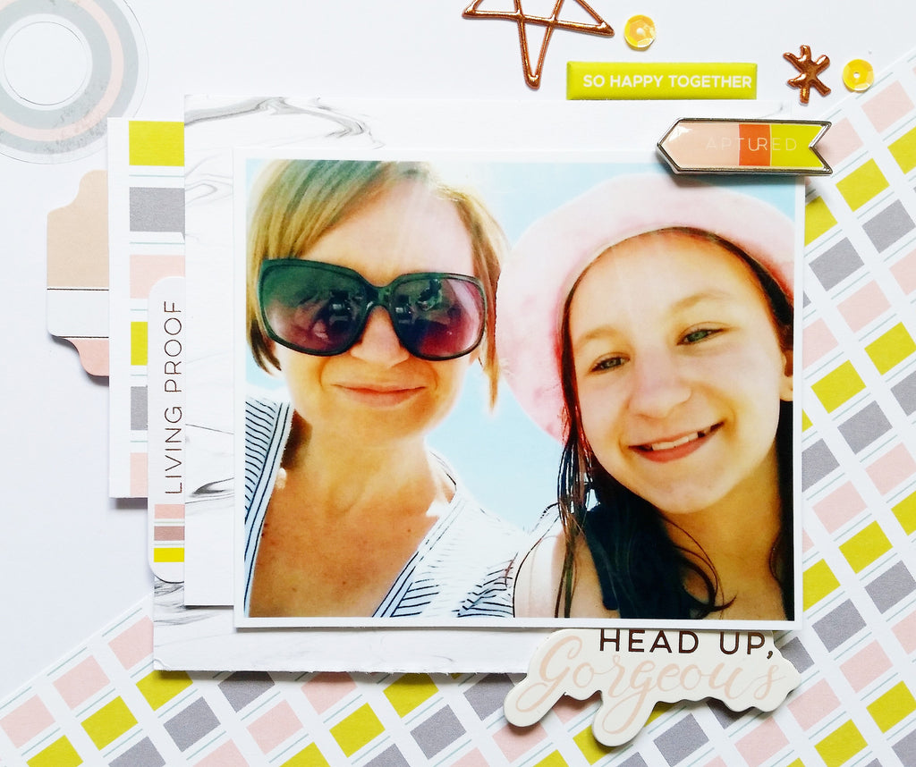
How fun, fresh and contemporary is this?!I absolutely adore this bright and fun colour combination and knew it would work perfectly with my happy photo! That stunning pattern paper is the reverse side of "Goals" and I am just smitten with these colours together!!! I really drew on this colour combination for all my embellishment selections too. The diagonal design on the pattern paper also encouraged my diagonal layout design and flow. How awesome is that Acetate Alpha title?!! Absolutely love it! As the layout is so 'cool', I added the copper Puffy Alphabet Stickers (stars & asterisk) to add a bit of warmth and balance to the layout. As well as few spots of red ;) Perfect!*Note: The sequins are from my personal stash*Here's a close up of that title, and the layers beneath my photo.....

I have used a journal card or two from the "Rise" paper, as well as Foiled Die Cuts to layer my photo onto. I just LOVE that 'Captured' Paperclip - I think it may be my favourite embellishment from Live More! Although, the Studio Puffs are pretty cool.....
Beautiful!Hope my two very different layouts have shown you how very versatile,
and OH-SO-pretty Live More is!
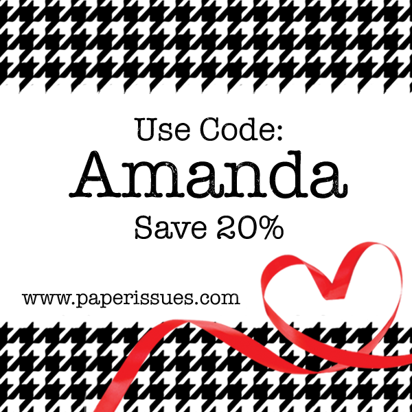
Need it?! Grab it in the Paper Issues store here & use my code AMANDA to receive 20% off!
Thanks for stopping by! til next time, Happy Arty Days, Amanda xo
Post a Comment