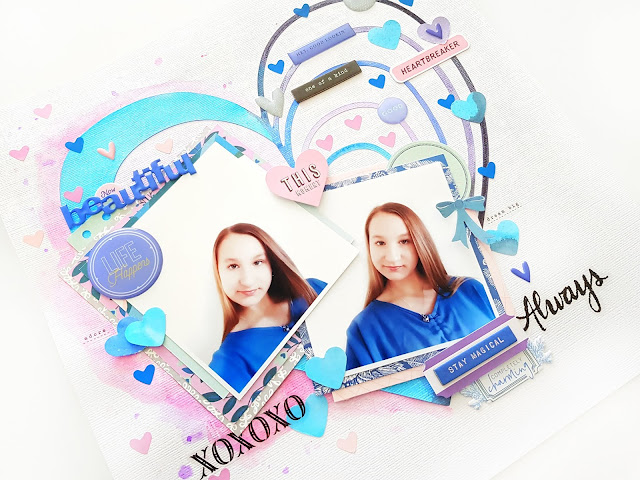
Shimmerz Paints: Beautiful Heart Layout & Process Video!


Hi Friends! 

I am so excited to share my latest Shimmerz Paints Education Team layout 
(& process video) with you all!
Today I am all about the super pretty blues & purples, and am focusing on the gorgeous Coloringz, Spritz Vibez paints. Yayyy!!!
But enough chatter, let's get straight into the good stuff!

Here's my layout, 

"Beautiful Heart"


And isn't she beautiful, indeed?!! 
You can see that my color scheme is drawn directly from those sweet photos of my darling girl, and the stark white of the photo background is also reflected in my white cardstock base too. 
But it's those pretty blues & purples that are winning my heart! 

Here's a closer look.....


All the shimmery goodness!!!

I have used the Heart & Soul cut file from The Cut Shoppe, and given it a few coats of our favorite shimmery paints! You'll spy
 Vibez: Snow Way Man on the left side of the heart, 
and on the right side (going from the outer heart first) you'll spot: 


I initially start by spraying them directly onto the cut file, but to keep things neat & to stop the colors from blending into one another, I end up using a brush to paint the cut file segments. 

Surrounding the left side of the heart is Vibez: Sweetheart & Coloringz: Vivacious Violet -
 SO very pretty!!!!


Lots of pretty coordinating embellishments, and those sweet inky hearts? 
Yes, you guessed it -  they're simply cut from my excess paint areas from my cut file. 
I can't bare to waste such gorgeous paints!
Here's another view.....

Such incredible vibrancy to these paints! LOVE!!!
And the softness of the pink contrasts beautifully with the bright blue & purples!


Just divine!!!


Want to see more?

You can watch 'how' this layout came together, including my tips for using these fabulous paints, 
in my process video HERE

You can also subscribe to my channel here too

I hope you really enjoy watching my video!


REMEMBER: Type AMANDA in the comments section of your Shimmerz Paints Store order & you'll receive a FREE paint* - yayyy!!! 

*no minimum purchase, can be used on as many orders as you like, not valid with any other discounts*


Thanks so much for visiting today!

Happy Arty Days, 
Amanda xo 

Cocoa Vanilla Studio: Boys Rule Altered Clipboard


Hi Creative Friends!

Welcome back to my Happy Arty Days blog!

Today I am sharing a super cool, off the page number -
an altered clipboard with the awesome Cocoa Vanilla Studio: BOYS RULE collection!
This project came about because my sweet boy wanted me to make him something for his bedroom that also featured his birthday photo. And when your children ask to have anything you make on their walls, well, how could I refuse?!!
I really hope he likes it!

"Awesome" Altered Clipboard


Isn't this fun?!! 
Such an awesome decor item for any cool kid's bedroom!
To start with, I just played around with a design for a 6" x 8" layout, and then once I was happy I rearranged it to fit onto the slightly smaller size clipboard. It was really fun working on a much smaller scale, and it challenged me to be really particular about my embellishment choices.
Let's take a closer look......

The BEST. Awesome, indeed!!!!
With that birthday photo being part of my son's design brief, I began by layering it with papers and embellishments to create a small photo cluster.
I apply a DIE CUT EPHEMERA frame over my photo, & then position this onto the denim look cut apart from pattern paper, CV-BR006 BOY STUFF.  
I insert a few ACCESSORY STICKERS & apply a larger frame (from the MISCELLANY pk) beneath it all.

Next, I embellish the photo frame with that Cool Kid FLAIR BUTTON, and the 100% Boy ACCESSORY STICKER (which I foam mount for added dimension). I add to this embellishing with a few stars from the CLEAR STICKERS, CHIPBOARD PIECES, DIE CUT EPHEMERA & ACCESSORY STICKERS.  The last adornment to that sweet birthday photo is the over sized, fussy cut camera from pattern paper, CV-BR006 BOY STUFF. Perfect!


I attach the photo cluster to the clipboard, angling it slightly off the edge of the board to maximise the clipboard space. I also want to highlight that it is a clipboard, so I 'clip' the top left corner of my cluster too!
With my photo taken care of, I now begin to decorate the board.....


I dress the base of the clipboard with pattern paper strips from, CV-BR006 BOY STUFF, & CV-BR002 STRAIGHT & NARROW. To this trim, I apply the Awesome DIE CUT EPHEMERA title with foam dots, and add another star ACCESSORY STICKER - because when it comes to birthdays, we can never have too many stars, right?! So cool!
I love the gold hardware featured on this board, but because it's SO shiny, it's a little distracting. I decide to tone it down a bit, by embellishing over it.....


I adorn the clip with fabulous King of the World ACCESSORY STICKER, skull & cross bones FLAIR BUTTON, and another star sticker - also from the ACCESSORY STICKERS. This looks a little more edgy, less polished & much more 'boy' - love it!
Travelling down the left hand side of the clipboard, I add a larger CHIPBOARD PIECES star, and then that double layered skull & crossbones. The double layer is so effective! 
Here's a closer look for you.....


Awesome!
You'll see that I start with the CHIPBOARD PIECES skull first, and then foam mount the DIE CUT EPHEMERA onto it.Very cool!
Further left, & on the back of the clipboard, I glue the grey scallop DIE CUT EPHEMERA shape. This trim adds an extra layer and point of interest to the overall design.

Beneath the skull & cross bones, I add yet another CHIPBOARD PIECES embellishment. 
This cool sentiment banner directs your eye back into the 'awesome' title & brings everything together. For final touches, I add one or two more stars, and a small journal with the typewriter font words from the ACCESSORY STICKERS.

And there you have it!
Simple, quick, boy decor that looks really AWESOME thanks to the amazing
I hope you enjoyed seeing my project today & are inspired to get creating too!

Thanks so much for visiting,

Happy Arty Days,
Amanda xo

MORE Exciting News!!!


Hi Happy Arty Days Friends!

Thanks so much for stopping by!

I am SO super-dee-duper excited to share with you that I will be part of the new Oct-March Design Team for The Cut Shoppe!


Yayyyy!!!!

I am so thrilled to be joining this amazing team! 
Here's what the new 2018 Oct - March team looks like....


Wow! What a talented line up! 
So honoured to be creating alongside these incredible creatives! 

I can't wait to share what I've been making with all the fabulous cut files!
But in the meantime, be sure to follow The Cut Shoppe HERE

& you can also check out all the files in the Etsy store HERE. 

Thanks for your continued support in my creative endeavours! 
Til next time, 

Happy Arty Days, 
Amanda xo 


Pinkfresh Studio: Indigo Hills 2 & all the pretty things!!!


Hi Friends! 

Time for a little Pinkfresh Studio inspiration, and oh.my.heart!
When the Indigo Hills 2 collection arrived, I had so much difficulty cutting into it! 
It's that incredibly beautiful!!! 
Such a gorgeous collection to document those special moments with! 
And in my case, simply the PERFECT collection for all those divine Ballet photographs of my sweet girl!
I could type for hours about the prettiness of Indigo Hills 2,
but instead let's allow my projects to speak for themselves.....

Here's my first layout, 

"Moments Are More Important Than Things" 


Sigh! Isn't this divine?!
So dreamy, & delicate!
I was immediately drawn to the softer, muted colors and tones in this line. This tranquil color scheme, partnered with the pretty blooms and ornate frames was just an angelic combination!
So pure, and innocent like my subject in the photograph! 
You'll spy the reverse side of pattern paper GORGE as my layout base. I just adore that pretty gray color! I have layered a 10" x 10" sheet of pattern paper, RIDGE (also the reverse side) onto it. To this layer I add a 9" x 9" smooth white cardstock layer,  but before sealing the two papers together, I tuck that DIE CUT EPHEMERA bloom in between these layers on the right hand side. Such a pretty detail!


Next, I frame my photo with that divine CHIPBOARD STICKERS oval frame, and then layer it onto that amazing CHIPBOARD STICKERS wreath. So whimsical! 
I tuck a few blooms (DIE CUT EPHEMERA & PUFFY STICKER) beneath the wreath. I foam mount my DIE CUT EPHEMERA title, 'Moments Are More Important Than Things' and layer it over the wreath, so it's resting on the edge of my framed photograph. Really pretty! 
I embellish around my photo cluster with more CHIPBOARD STICKERS, GOLD FOILED WOOD STICKERS, and even some ENAMEL DOTS. 
I add a subtitle, 'love' which I also mount on foam tape and surround with a few more of the ENAMEL DOTS.  


Last, but by no means least, I add my type writer font journaling to the base of my layout & embellish with a final PUFFY STICKER & ENAMEL DOT or, two. 
 

So beautiful!
All the pretty and delicate details on this sweet page! 
I hope she'll treasure it for years to come! 
My second layout embraces the more sassy, fun & playful side of my sweet dancer.....

"Ballet Besties, Mirror Selfies"


Isn't this beautiful?!!
And with such a different look photo, I was able to draw on the deeper, richer purple & indigo tones of this collection! Purple LOVE!!!
I have opted for the very pretty, HIGHLAND pattern paper as my layout background. The striped triangle detail in this paper is so striking and really caught my eye. With this in mind, I decide to position my photo here to ensure it remains the focus of my page! 
Beneath my photograph, I layer pattern paper VALLEY, as well as the reverse side of paper RIDGE, DIE CUT EPHEMERA, PHRASE STICKERS & one of those divine JOURNALING SPOTS with FOIL ACCENTS!
Such awesome layers!!!


I surround this pretty photo cluster with a mix of PUFFY STICKERS, ENAMEL DOTS, CHIPBOARD STICKERS, WOOD STICKERS with FOIL ACCENTS, PHRASE STICKERS & even some gold asterisks from the GOLD PUFFY ALPHA STICKERS. I try to respect the diagonal flow of the striped pattern within this embellishing too.
You'll also notice that I adorn my photo with a PUFFY STICKER sentiment - cute!  


My title is created with a mix of both GOLD PUFFY ALPHA STICKERS and purple MINI PUFFY ALPHA STICKERS, and follows the movement of the laurel leaves in the pattern paper. So simple & yet, so effective!


And there you have it! 
My first play with the all.the.pretty, Indigo Hills 2, things!!!!
I hope my layouts have inspired you to get creating with this simply stunning collection! 

If you liked my projects please be sure to check out my newly created
where I will be uploading lots of Pinkfresh Studio inspiration! 

Thanks so much for visiting! 
til next time, 

Citrus Twist Kits: Sunday Sketch with the Good Stuff Kit!


Happy Sunday Lovelies!

My turn on the Citrus Twist Kits blog with today's super fun Sunday Sketch!
Here's what it looks like....


Oooh! How AWESOME is this sketch?!! 
I loved it as soon as I saw it, & couldn't wait to play along with this design! 
For today's sketch I wanted to showcase how fantastic the September "Good Stuff" Add-On Kit is - 
here's what I came up with.....

"En Pointe" 


LOVE!!! 
Such a special moment documenting my daughter's first pair of pointe shoes! Milestone moment for every young danseur & ballerina! 
And how gorgeous is this Add-On Kit?! Everything you see (apart from my cardstock base) is from this kit! Now that's cool! 
Here's a closer look....


As it's a ballet page, I just had to draw on all the pink elements from the Good Stuff Kit. The Vicki Boutin Die Cut Ephemera pieces, combined with the MME Girl Meets Glam Decorative Brads, were the perfect option for all the ticket / tag elements in the sketch! They really pop against the otherwise black & white page!  Pretty! 


For the pattern paper trim, I use the subtle polka dot pattern paper from the Maggie Homes: Willow Lane 6" x 8" Paper Pad. This paper also inspires the use of the polka dot alpha Thicker, as well as the coordinating brad over my photo. Sweet!
Carefully considered embellishments to adorn my page!


For finishing touches, I use the MME Girl Meets Glam Enamel Dots as an alternative to the paint splatter on the sketch. Love how this looks! 
You can never have too many enamel dots, right?!

And there you have it! 
My take on Citrus Twist Kit's awesome Sunday Sketch! 
Get yours HERE. 

I hope I have inspired you to play along - I can't wait to see what you create! 

Til next time, 
Happy Arty Days, 
Amanda xo 


Pebbles: Spooky Halloween Layout & Process Video


Hi Creative Friends!

Welcome back to the Happy Arty Days blog!
 I am so SUPER excited to be sharing my Pebbles: Spooky Boo! interactive Halloween layout & process video with you all today!
Halloween is such a fun Holiday, and the Pebbles Spooky Boo collection is perfect for documenting those happy haunting moments! 

Here's a quick peak at my completed layout, "Spooky Halloween".........


Isn't this fun!!!  I just adore that mix of orange pattern papers on the pumpkin cut file!
And the interactive Halloween 'trick' element comes into play as we lift the pumpkin flap.....


To reveal a surprise BOO!!!!


Happy Haunting!
I just love how super cute & fun this is!


& all those sparkly black glitter embellishments!!! Gorgeous!


Everything in this collection is so perfectly designed to meet all your Halloween crafting needs!


Aww! How sweet are my two trick'o'treaters?!!
Want to see more???
Join me in this short process video, as I take you from start to finish with this Spook-tacular page! 


I really hope you enjoy watching!
Thanks so much for visiting today,
til next time, 

Happy Arty Days, 
Amanda xo

Other Supplies:

Pinkfresh Studio Liquid Watercolor Video Hop


Hi Friends! 

I am so thrilled to be participating in the 

Pinkfresh Studio Liquid Watercolor Video Hop!

Yayyy! How exciting & so.much.fun!!!!
Like all good hops, there's some awesome giveaways going on & of course, amazing inspiration, tips & techniques on how to use these gorgeous watercolors!
There's a giveaway on every stop along the way - so lots of chances to win!

To start the Video Hop, find out all the giveaway details, & view the entire hop list, 
you'll need to visit Pinkfresh Studio HERE. 


Here's a sneaky peak at what I've created for this hop.....

"Present & In Awe"


Oh my heart, this is gor-jus!!! 
I have combined the beautiful Simple & Sweet collection with those amazing watercolors & I just love the result!
Here's a better view for you......


Oh.so.beautiful!!!

You can see exactly how I created this stunning page by watching my video HERE

(& by liking and commenting on my video you go in the draw to win 
a $25 Pinkfresh Studio Gift Card! Yayyyy!!!) 
So be sure to check out this amazing Video Hop & Good Luck with all the giveaways!

Thanks so much for stopping by today!
til next time, 

Happy Arty Days, 
Amanda xo 

Elle's Studio: Hazel Alphabet Stickers Spotlight!


Hi Friends! 

Welcome back for more Elle's Studio inspiration!

I just adore the Hazel Alphabet Stickers
and today I'm shining the spotlight on these fabulous alphas!!
I couldn't resist using both the white and the light purple varieties on my layout! 
They were perfect for documenting my daughter's love of desserts!
So without further ado, here's my layout, 

"Story Of Dessert"


Pardon the pun, but isn't this the sweetest?! 
I have used those fabulous Hazel Alphabet Stickers as both a border trim on my white cardstock, and as washi tape strips on my vellum sheet. 
Here's a closer look.....


So gorgeous!!!
Loving all that pretty purple!
I alternate colors between each story descriptor, mainly names of her fave desserts, and also use the stickers in my 'the story of dessert' title.
And yes, despite being a very petite ballerina she has an enormous sweet tooth! 


I use the word 'yum' repeatedly to for the faux washi tape. Awesome!
You'll also spy the Exclusive September Kit, Good Eats wood veneers from the September new releases, as well as our List & Ledger Journaling Tags and Noteworthy collection. 


Delicious, indeed!
Such a fun way to tell stories on your scrapbook layouts!


How amazing are these tiny alphas?!!
I just LOVE them!
Get yours from the Elle's Studio shop HERE 

I hope my layout has given you a few different ideas on how to use these fabulous 
Hazel Alphabet Stickers in your creating! 

Thanks so much for visiting,
til next time, 

Happy Arty Days, 
Amanda xo 


Cocoa Vanilla Studio: Throwback Thursday - Hello Lovely!


Hi Creative Friends!

Time to share a lil  Cocoa Vanilla Studio love, 
& today I am celebrating Throwback Thursday with the gorgeous Hello Lovely collection!
I made SO many beautiful creations with this line when it was first released back in 2015, 
but it seems I'm still LOVING it as I had no trouble creating with it again! 
It's just soooooooo preeeeeetty!!!

Here's what I came up with,
"Love You"

Ga ga gorgeous!!!
You'll spy lots of pretties here!
I start with a white cardstock base, to which I add a scalloped punched border trim with pattern paper, CV-HL002 GLIMMER.
Next, I cut out that divine Butterfly Ring cut file (from Citrus Twist Kits) with our super beautiful CV-HL006 FLOWER PATCH pattern paper.
 Absolutely gor-jus!!! This pretty floral paper is simply heavenly! I draw on the colors to inspire my mixed media base.


The media is a simple series of coordinating watercolor rings, paint flicks & splatters. Lots of fun! Once dry, I apply the Flower Patch butterfly ring, and begin to embellish the cut file.
First, I frame my darling photograph with an DIE CUT EPHEMERA frame, and then adorn it with pretty blooms....

Oh how darling is this?!! 
So super sweet!
Next, I take as many butterfly embellishments that I can find, and add them to my page! I love the look of layered butterflies, so I use a few DIE CUT EPHEMERA ones on my cut file butterflies. Cute! For a bit of 'wow' factor, I also fussy cut that beautiful Monarch butterfly from pattern paper, CV-HL005 LUCKY DIP and add it to the largest butterfly in the ring. Talk about a feature piece! This is such a beautiful detail!


Isn't it something?!!
If you look carefully, you'll also spy a few teeny tiny WOOD VENEER butterflies layered on the cut file, as well as scattered around the ring, too! Speaking of veneer, I use the exquisitely cut 'love you' WOOD VENEER as my layout title. So awesome!


To draw a lil more attention to the title,
 I add that stunning brass LUCKY CHARMS arrow to direct you in!
For the remainder of my layout, I simply decorate and embellish on and around the butterfly ring with SEQUINS, ENAMEL DOTS, DIE CUT EPHEMERA & more WOOD VENEER. With such a darling photograph, I can't resist adding a few DIE CUT EPHEMERA & VELLUM HEARTS. So Beautiful!

 
Such a simple design, and yet so incredibly detailed and beautiful!

 
All the butterfly LOVE!!!
I hope my layout has inspired you to go back and revisit some of the older 
Cocoa Vanilla Studio collections! 
I think it's safe to say that they're still winning my heart over! 
Hello Lovely, indeed!
You can view ALL the collections HERE in the Cocoa Vanilla Studio Shop.

Thanks so much for visiting!
til next time, 

Happy Arty Days, 
Amanda xo