Hi Crafty Friends!
Welcome back for more Cocoa Vanilla Studio inspiration!
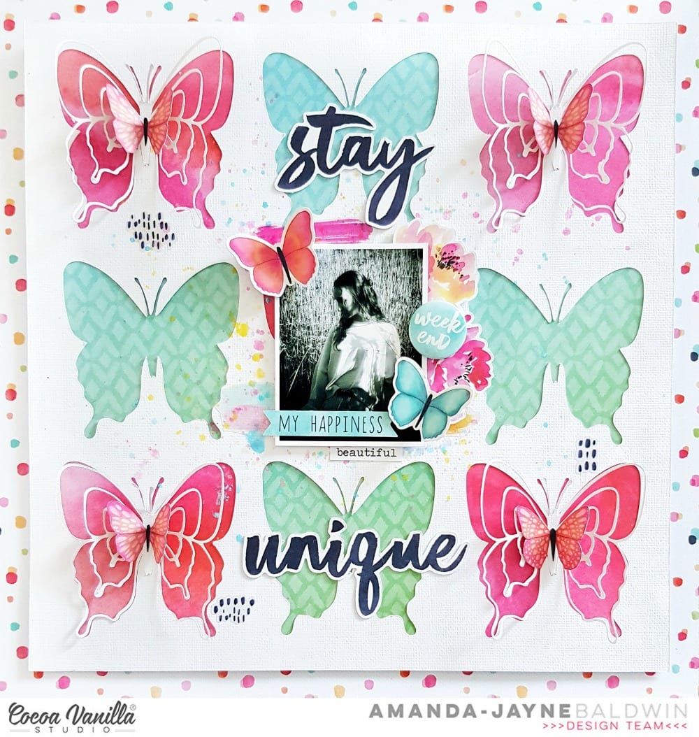
Today I am sharing another butterfly theme layout with the gorgeous HAPPINESS collection.
This time I've taken some inspiration from fellow teamie,
Anna Komenda ('cos she's one awe-inspiring creative!)
& I just love how it turned out - hope you like it too!
"Stay Unique"

Wow! Isn't this super pretty?!!
I love a good grid design, & when I saw Anna using butterflies for the 'boxes' I knew I'd have to lift her design! It's seriously SO cool! I've mixed mine up a bit though, & created a fun new look with our beautiful HAPPINESS pattern papers, LOVE!!!
I started with the fabulous polka dot pattern paper, CV-HA002 SPRINKLES as the 12inch base. I used my silhouette software to arrange the butterfly cut file ( Butterfly Wings courtesy of The Cut Shoppe) into a grid design. I cut out all 9 butterflies and saved the 'off-cut' negative to create my background with. I trimmed the white cardstock 'off-cut' to 11" x 11" and then proceeded to back all the butterflies. I selected pattern papers, CV-HA009 MEADOW & CV-HA004 FRAME OF MIND and alternated them throughout the white cardstock background. I love how pretty the pink and blue/green silhouettes look! Simply stunning!

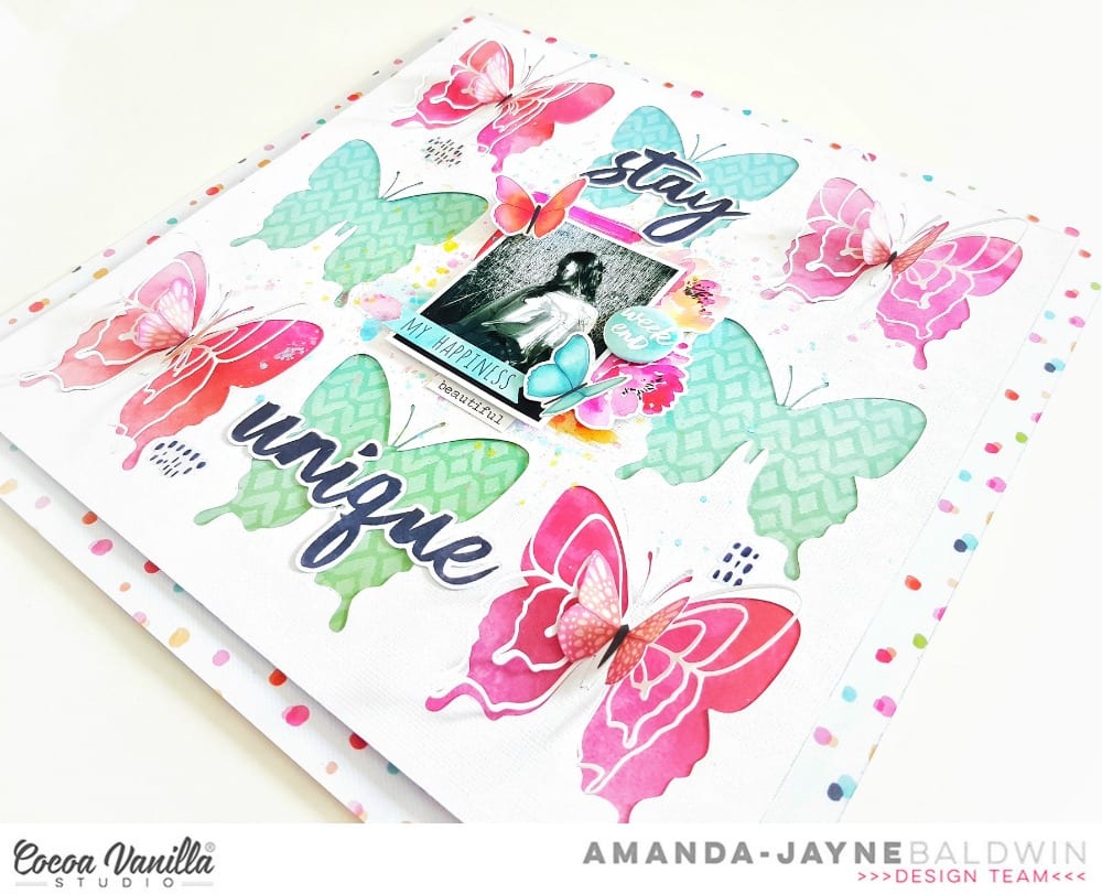
Next, I used a sheet of 'fun foam' to back the entire 11" base, before gluing it onto the SPRINKLES base. This gave my layout a little lift and added some subtle dimension too! With the base of the layout completed, the rest of the layout was all about my sweet photo and embellishments!

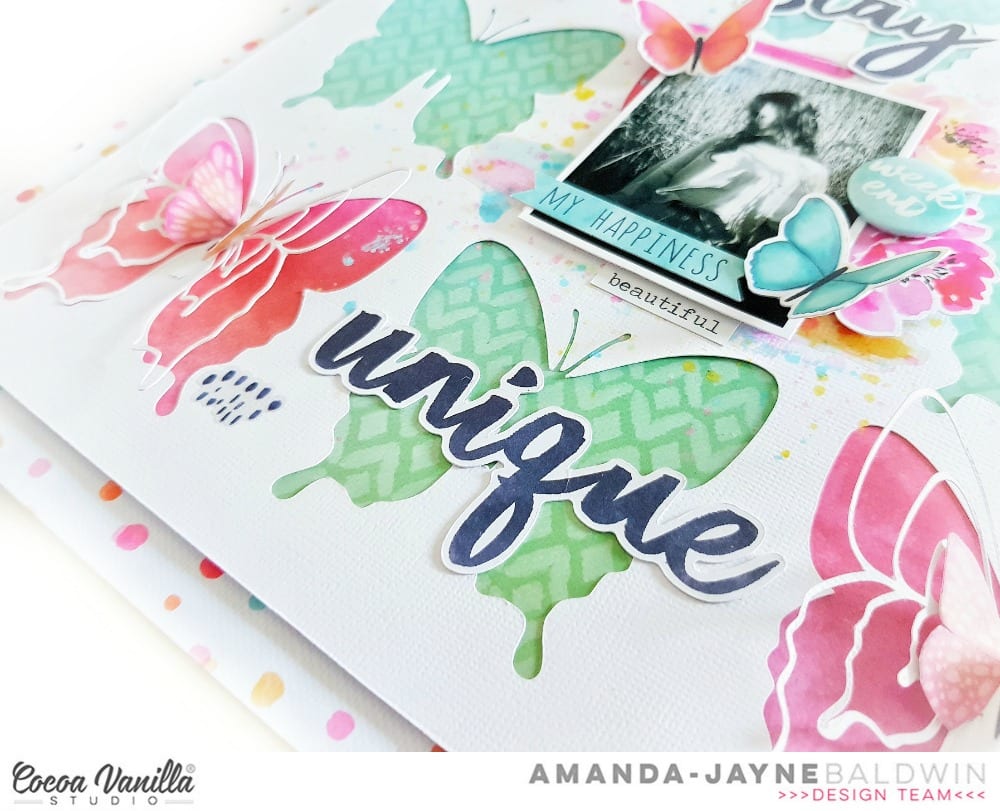
On the pink butterflies, I layered one of the cut file butterflies, followed by a fussy cut pink butterfly from pattern paper, CV-HA008 BRIGHT & BEAUTIFUL.
Here's a closer look for you....

Simple and yet, oh so effective! Beautiful!

I chose to leave the FRAME OF MIND butterflies free from embellishments, as the detailed design on the pattern is just too pretty to cover, don't you think? That said, I did end up covering two of them with my CARDSTOCK TITLES, Stay Unique, but I tried to keep that lovely pattern visible.
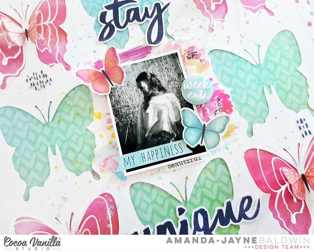
Next, I applied a few painty splatters of color in the center of the page, spreading out towards the butterflies. This subtle hint of colour breaks up all the white and adds that extra point of interest. Once dried, I built my photo cluster over the center butterfly....

You'll spy that I used the brush stroke CLEAR STICKERS (complimenting the previously applied paint splatters) beneath the cluster, & then added in some DIE CUT EPHEMERA blooms. I foam mounted my sweet girl's photo, and then embellished it with a DIE CUT EPHEMERA sentiment label & 2 pretty butterflies. I tucked in the beautiful sentiment from the ACCESSORY STICKERS, and finished off with that awesome FLAIR BUTTON. For final touches, I added a few more CLEAR STICKERS around the page.

And there you have it!
Super beautiful creating with the HAPPINESS collection!
I hope you have enjoyed seeing my project today, & feel inspired to get creating today!
Thanks so much for your kind comments & support!
til next time,
Post a Comment