Hi Friends!
Welcome back for more Elle's Studio inspiration!
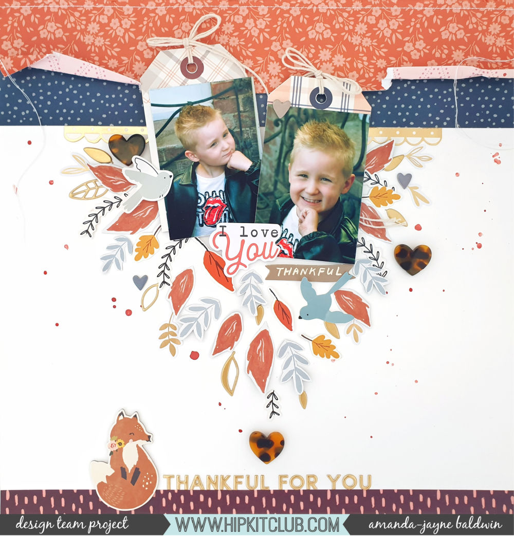
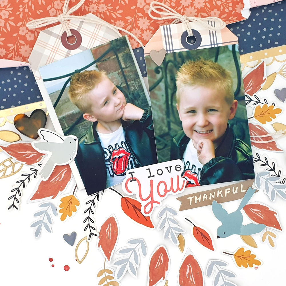
Today I am sharing some memory keeping love with the gorgeous November Kit and new release items! It's true, I'm a biased fan of all thing Elle's Studio, but let me tell you why....
Every month, regardless of the season or any holiday theme, there's always plenty of products to document your everyday stories. Elle's Studio products are so varied and non-specific that they appeal to me for all types of creating; scrapbooking, card making, pocket pages, mini albums, and off the page items, & most importantly, they are non-gender specific. I am able to tell everyone's stories with Elle's Studio monthly kit - YAY!
Why is that important?
Well, take today's project and the somewhat Christmassy vibe of the November Kit (and new releases) and you'll understand exactly what I'm talkin' 'bout....
Other Supplies: Bazzill Cardstock-Avalanche, & sequins.
This is awesome!
Not a Christmas layout, no pink to be seen and yet I used the very same
November Kit and new release items that I also created these 2 very pretty in pink Christmas pages with...
Wow, talk about versatility! See why I LOVE all things Elle's Studio?! It's all about balance, beautiful colors & patterns, high quality, varied products and a chance to document my stories, my way!
Speaking of documenting stories, let's chat about today's layout!
First up, I had quite a long title that I wanted to feature on my page. The solution? I wrapped my title around my photo cluster to create more space for all the words. I also mixed my alphas for 3 key reasons; 1. So I had enough of each letter/numeral required, 2. So the words would all fit (the smaller Jane Tile Alphabet Stickers were perfect for the Show's long name) & 3. To create interest and keep you reading!
I love how effective that long, circular title looks!
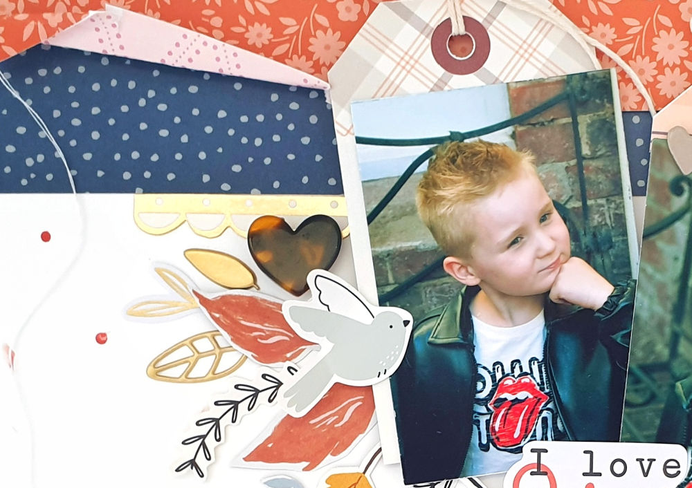
Secondly, at the time of creating this page, I only had the one small photograph to work with. With such a big title, my photo was bound to get lost. The solution? I created a large base of mixed 3 x 4inch notecards from the November Kit, and Fa La La papers to mount my photo onto. To make my photograph appear 'bigger', I cut the 3 x 4" cards into half, and fanned them out behind my photo. This not only created a point of interest, but also widened my image.
For my layout color scheme, I chose colors that featured in my photograph. This created a more cohesive look and unified all the different elements throughout the page.
Those Acrylic Christmas Trees were the perfect adornment to my photo cluster. You'll spy that trees are featured in my photo background, the Show name is all about forest life, the trees coordinated with my color scheme and they aided in the widening of the cluster's appearance. Awesome!
Did I mention that I love the versatility of Elle's Studio embellishments?! I also used a Holiday Foodie Sticker, and the Very Merry Chipboard Stickers to emphasize my photo cluster despite having no relevance to food or Christmas! See what I mean about every month being so varied and suitable for all kinds of creating and story telling? Love it!
The Currently Labels happened to feature 'watching, listening and singing' and yes, you guessed it, worked with my color scheme. Needless to say I just had to use them, but to make them stand out that tiny bit more, I foam mounted them all for good measure!
The tiny yellow stars are from the Acrylic Christmas Trees, & I couldn't resist sprinkling them around my title. If you look closely, there's a pop of yellow in my photo background, and those tiny stars really enhanced this! Simple, well considered placement of embellishments makes all the difference!
And there you have it!
Another handful of reasons as to why I think Elle's Studio products are the very best,
and another fabulous layout to add to my sweet son's album!
Wasn't he cute as 'Ratty'?
Thanks so much for stopping by today!
I hope I have inspired you!
til next time,


