Pages

Wednesday, 31 May 2017

Paper Issues: Product Spotlight: Echo Park

Hi Creatives! 

Welcome back for another super fun 

Paper Issues: Product Spotlight

Today we're shining the spotlight on ANY of the new Echo Park collections!
There are so many awesome lines in the store at the moment,
I chose the all new Summer FUN for mine!


Absolutely gorgeous!!!
Here's what I've created with it.....

"Happy"


So very happy indeed! 
Just look at those Summer FUN colours! 
The florals, the flamingos and that mixed media background - love it all!!!
Perfect Summer line for my pretty Miss!
Most of my layout has been fussy cut from patterned paper Summer Floral, but you'll also spy brads, chipboard stickers, element stickers and ephemera from this line too!
So much pretty in one collection!

Here's a closer look at that chipboard flamingo.....


Ga-ga-gorgeous!!! 


Echo Park are seriously winning my heart with ultra pretty floral Summer line!

Loving it too? Grab yours here in the Paper Issues store 
& REMEMBER: Use my code AMANDA to save 20% off your total spend!


Want to see more with the Echo Park collections? Visit the Paper Issues blog here
& thanks so much for stopping by today, 
it means so much!

til next time, 

Happy Arty Days, 
Amanda xo 

Saturday, 27 May 2017

Cocoa Vanilla Studio: You're Awesome You ROCK!!!

Hi Everyone!

Boy-oh-boy have I been hanging out to share my first layout with the totally awesome boy collection from Cocoa Vanilla Studio: You ROCK!
This collection is just so much fun & I couldn't wait to use it for my Mr A for Awesome! But enough chatter, let's get straight into the good stuff!

Here's my layout,
"You're Awesome You ROCK"

Isn't this the coolest?!!
 The You ROCK collection is just so incredibly awesome that I just had to use it all in the one layout! Yep, you read correctly! 
You'll spy at least one of every item from the line on this page! 
The circular design really lends itself to embellishing and WHOA! Doesn't just scream fun?!!

Moving away from that mixed media feast and circle sensation for just a moment, you'll notice that I introduced small trianlges into the page design too. There's a method to my madness here!  
I've used a whole lotta stars for embellishment, and stars have very sharp angles which contrast against the circle design. By adding the opposing corner triangles to my layout, I've created balance and a little unity between both geometric shapes. It creates a more natural flow for the eye. 
I've used WASHI STICKERS and foam mounted patterned paper, CV-YR005 NIGHT SKY to achieve this look.

Back to that awesome circle now.....

Let's start at the center!
How fabulous is that Wood Veneer title?!
 From the rockstar font to the boldness of the size; this veneer means business! Let's get loud and shout it out! LOVE it!!! 
You'll see that I've mounted my title onto a foam taped, old school View Master film from the DIE CUT EPHEMERA packet. I love that it's been printed to look like a misted newspaper, and practice target - so cool! It really makes my title pop and be the central focal point for this design! 
There's a super cool CHIPBOARD STICKER arrow beneath it all directing your eye into my photo next....

With such a big impact title I kept my photo small, simple,  as well as black & white, to contrast all the other page elements. I've layered my photo with both sides of the patterned paper CV-YR005 NIGHT SKY, a tab ACCESSORY STICKER, the RAD RUBBER CHARM,  and even a strip of the WASHI STICKERS to support it. To the lower right hand side of my photo, I've also embellished with that Awesome FLAIR BUTTON, some black cotton from my stash, and another terrific DIE CUT EPHEMERA piece.
 Here's a closer look......

That's My Boy, indeed! SO cool! 
Check out those stars and ENAMEL SHAPES too!!!
Some of the stars in my circle are fussy cut from the pattern paper CV-YR001 STARSHINE, others are DIE CUT EPHEMERA, ACCESSORY STICKERS, CHIPBOARD STICKERS and even RUBBER CHARMS! 
(I warned you - I had to use ALL the things! )
Here's another look at the circular design and all those stars.....


Even the arrow has it's own star! Such a bold and playful collection! Loving it all!
And I can't go past that banner RUBBER CHARM!!! How incredible! It forms the first part of my title, and I LOVE it! It's mounted onto a small WASHI STICKER strip for a lil extra highlight!
Total Awesomeness!!!

And there you have it! 
My first creation with the super cool You ROCK collection! 
Hope I have inspired you to get creating with it too!
Thanks so much for visiting and leaving a comment - it really means so much!
til next time,
Happy Arty Days, 
Amanda xo 

Monday, 22 May 2017

Paper Issues: May Swag Bag Sunday

Hi Happy Arty Days Friends!

Time for some Paper Issues Swag Bag inspiration with this month's edition of 


The April Swag Bag is a golden delight!
Here's a peak at how awesome it is....


Ummm, WOW!!!
It's no secret that I love me a swag bag or 3, but seriously, this one is a MUST have! 
Possibly my most favourite Swag Bag of.all.time!!!
And because it's so awesome, 
I made 2 layouts with it (& still have left overs too! Yay!)
But enough chatter, here's my first layout....

"Hello Handsome"


Hello Handsome, indeed! Love this lil guy!
It's Autumn (Fall) here in Australia right now, and the golden hues in this Swag Bag are a perfect match for my Fall photographs! How cute is my Mr a for Awesome in those leaves?!!
Adorable!
I've used a patterned paper strip from Heidi Swapp's Magnolia Jane line, as well as that gorgeous woodgrain from Fancy Pants Designs' Golden Days collection for the base of my layout. 
Everything else you spy is from the Swag Bag! 
I know, so much awesome in one lil bag!!!
I just love that journaling / tag pocket, and that copper arrow is a firm fave!
Here's another look.....


Oh that straw! So cool! 

Here's my second layout, 

"Love"

Such a different vibe from the first layout, and yet such a fabulous Autumn page! 
Love this!
Apart from my white cardstock and watercolor paint, 
everything you see is from the Swag Bag! So much awesome in these mini kits!
Here's a few close ups for you....


That tag is seriously cool! 
It's from the Heidi Swapp Magnolia Jane collection & I may have just ordered more of these! ;)


Happy. Beautiful. Love. 
It says it all!

And there you have it!
My Swag Bag inspiration for May!

Grab yourself a Swag Bag (or 3 like me!) in the Paper Issues store here. 
& REMEMBER: Use my code AMANDA & you'll also receive 20% off!


Need more Swag Bag inspiration?
See what the rest of our talented team has created here

Thanks so much for visiting today!
I hope I have inspired you to get creating!
til next time, 

Happy Arty Days, 
Amanda xo 


Wednesday, 17 May 2017

Paper Issues: Product Spotlight: The Outdoors!

Hi Happy Arty Days Friends!

Time for another super fun Paper Issues Product Spotlight! 
This spotlight is all about The Great Outdoors - no set scrapbook manufacturer, just anything that embraces the outdoors.
Naturally, I couldn't look past the stunning Cocoa Vanilla Studio collection: Wild At Heart!
Here's my outdoorsy layout,
"Growing Wild"


Isn't this the sweetest?!!
So very pretty indeed! 
The florals in this collection are so stunning, and work beautifully with my sweet photo!
Here's a few close ups....


Omgoodness! Could they get any cuter?!!
Loving those layers beneath my photo too!


Love that pretty cluster - sweet indeed!

If you're looking for The Great Outdoors, 
Cocoa Vanilla Studio: Wild At Heart definitely has you covered! 
Need it?! 
No dramas, you can grab it all here in the Paper Issues store
& REMEMBER: Use my code AMANDA to save 20% off your total spend! Yay! 


Needing more inspiration?
See what the rest of our amazing team have created on the Paper Issues blog here!

Thanks for visiting, 
til next time, 

Happy Arty Days, 
Amanda xo 


Tuesday, 16 May 2017

Paper Issues: *NEW CHALLENGE* Try It Tuesday


Hi Happy Arty Days Friends! 

Welcome to another brand new, super fun Paper Issues challenge:

TRY IT OUT TUESDAY

( & it's hosted by yours truly!)
 Yep, I'm upping my efforts, and hosting 2 challenges now on the Paper Issues blog!
 Please support me & play along!
I promise they're super easy and tons of fun
PLUS every time you enter, you go in the draw to win a Paper Issues gift card - YAY!!!

This challenge is all about giving something new or different, a good old fashioned go!

This month we're going to try.....

Just Add Water

Simply use water soluble or washable markers, paints, gelatos or even stamp pads & inks and apply water to them. Watch how they react!!! Tilt ur page and watch the colours run!
Super fun and a cool result too!

Here's a quick 'how to' if you're not sure what I am meaning....


Draw, scribble, make marks with your NON waterproof pens. You'll see that I used my 4 year old son's Crayola Washables for mine - they work really well for this technique!


Apply water!
I wanted to maintain my shape, so I added lots of water and used brushstrokes for mine. I didn't tilt my page, but I did use the water puddles to wet my brush and splatter with.
If you're more adventurous, try a misting spray bottle, and hold your cardstock upright and watch for the colour runs!!! Awesome!
*If paper warping bothers you, be sure to use a heavier gsm cardstock, or apply a layer of gesso first.
For the record, I used the regular American Crafts 80gsm cardstock for this layout, the warping was minimal*

I hope you'll join us this month, and try this fun technique out!

Here's my completed layout,

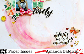
"Lovely"

Isn't the result spectacular?! Who would've thought toddler markers could be so effective! 
I've teamed mine up with Maggie Holmes Chasing Dreams collection, and a sweet Bitty Bow from Cocoa Vanilla Studio! Divine! 
Here's a closer look......


Blooms, butterflies and hearts! *sigh* All the pretty things!!!
I always intended to use this collection, so when I made my 'marks' I tried to mimic the flight path of the butterfly. Kinda adding a little whimsical feel to it all! 


So soft and pretty! 
Who needs watercolour paint when you have markers?! 

Wanna see some more inspiring layouts from our incredibly talented team? 
Visit the Paper Issues blog here  - our design team never fail to inspire! 

I can't wait to see what you'll TRY for this edition of Try It Tuesday!

Upload your creations HERE in the Paper Issues Friends & Fans Facebook Group May Challenge album & go in the draw to win a Paper Issues gift card!!!

Need supplies? Visit the Paper Issues store here 
& REMEMBER: Use my code AMANDA & you'll save 20% off your total spend! Yay!


Thanks so much for visiting!
til next time, 


Pinkfresh Studio: Mixing It Up for May!

Hi Creative Friends & Fans!

Today I am mixing it up for May with my Pinkfresh Studio creating!
I have two layouts that use all three of their current collections; 
The Mix No.1, Dream On & Live More!
 I know, how fun & inspiring!!!

First up is this super sweet page, 
"You Can Do Amazing Things"


Isn't this delicate and divine?! Such a pretty page for my pretty girl! 

*Please note: The tassel and sequins are from my personal stash, and not from  Pinkfresh Studio*

To create this layout, I took the pattern paper "FOCUS" from the LIVE MORE collection and fussy cut the chevron design. I repeated this with the same paper in the 6 x 6 Paper Pad. I then layered the fussy cuts together on white cardstock to create a new, more unique design. I used foam tape on the largest chevron to create dimension and more interest. This 'focal' chevron also directs you to my sweet photograph - love how this looks! So bold in intention, and yet so soft and pretty! 

Here's a closer look...


Wow! That foam tape really does make all the difference! 

You'll spy a much smaller, less obvious FOCUS chevron beneath my photo cluster. However, this one points in the same direction as that stunning arrow Paperclip 'Today'. That stunning embellishment is also from the LIVE MORE collection and is one of my fave go-to items from this line! But there's also a few pretty items from the Dream On collection adorning my photo too....... 


I used the minty "MARVEL"  pattern paper (6 x 6 Paper Pad size)  from the DREAM ON line for the bottom layer of my photo cluster. It's so fresh and light, & it coordinates beautifully with the LIVE MORE items! I've also used a few Die Cuts from this range. I included them as embellishments for those delicious photo layers! I could seriously do with a whole packet of just those leaves - just awesome!!! That stunning title is also from the DREAM ON Die Cuts packet, and again, the colours partner so perfectly with the LIVE MORE products it's incredible! 
For finishing touches, you'll spy a DREAM ON Layered Chipboard Sticker heart in a soft coordinating pink, as well as those fabulous Puffy Sticker hearts from The Mix No.1 collection. I love these bright embellishments; the matte finish on them is just so classy!!!
Such a simple, but oh so delicate and divine layout!
I hope you liked this one as much as I do! 

My second layout is all about my beautiful family and our special moments together, 
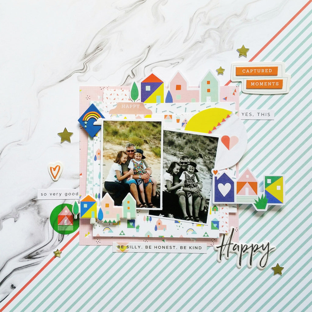
"Happy"


Love how fun and playful this is! Truly happy! 
Lots of bright, eclectic embellishments on this page too!
I have used the LIVE MORE pattern paper, "HONEST" as the base for this scrapbook page. I love that diagonal design, and used that orange line as an anchor for centering my photos! 
I wanted to showcase the fabulous 6 x 6 Papers for this layout, so I created quite larger layers beneath my photos, starting with the DREAM ON 6 x 6 paper, "DAYDREAM", and then "MARVEL". You'll also see the LIVE MORE "EMBRACE" and  reverse side of "FOCUS" papers tucked in there too! The layer directly beneath my happy photos is created from DREAM ON pattern paper, "MARVEL" but I've used the reverse side. I love the bright colours, and those cute little homes! Nothing says family like a happy home ;)
Infact, you'll notice I followed through with the homes theme in my embellishing! 
But enough chattering, here's a closer look at those lovely 6 x 6 paper layers....


Oh those layers are just divine! 
You'll notice that I used a layer of cardboard beneath the final layer to really make it 'pop' and add more dimension! There are a few Die Cuts from both LIVE MORE & DREAM ON layered with my photos - really building up that larger photo cluster! Love that small photos can feel large too! 
How cute are those Die Cuts and Puffy Sticker homes from DREAM ON?!! There's even a cute Washi Tape house too! Adorable!
Talking all things adorable, how about that rainbow Rubber Chip - so super cute!!!
And I am just loving how effective the Layered Chipboard Stickers look! 
Here's another view, check out that 'Captured Moments' layered chipboard.....


Totally awesome! 
I've used a DREAM ON Puffy Sticker for my title, "Happy". I love the whimsical font! 
I also love the sentiments in the LIVE MORE Phrase Stickers, and have used them to journal around my photo cluster. Perfect! 
For finishing touches, I've used The Mix No.1 collection again! This time I'm using the Gold Foam Shapes (the stars specifically) to add a lil bling & to keep with the playfulness of the layout.

And there you have it!  
My two layouts that mix up the gorgeous Pinkfresh Studio collections!
I hope they've inspired you to get creating! 
And using those 6 x 6 paper pads too!

& REMEMBER: Use my code AMANDA & you'll also receive 20% off your cart total! 


Thankyou so very much for visiting!
til next time, 

Happy Arty Days, 
Amanda xo 

Saturday, 13 May 2017

Paper Issues: *New Challenge* Project Pocket


Hi Creatives!

It's time for another of the all NEW challenges starting this month at Paper Issues;


And as you can probably guess by the title, 
it's all about those PL inspired, pocket pages!
This is so outta my comfort zone, but I really wanted to give it a go!

This month the challenge is to simply create any size pocket page - anything goes!
I chose to create a super sweet 4 x 4 Becky Higgins album for mine, and decorated it in 
Pinkfresh Studio Live More, Dream On & The Mix No.1 collections. I hope you like it! 

This is the album cover.....


Isn't this the cutest lil mini album?!! 
Let's take a peak inside....


2017 Stories - Life In Pictures! Perfect opening and title page! So super cute!


Nawww! It just keeps on getting cuter!!! Love these two munchkins!


Truly, so adorable!
In my usual style, I have kept the journaling hidden, and tucked inside the pockets ;)
And there you have it! 
The first couple pages in my new scrapbook mini album!
I hope to share some more pocket pages with you soon!

Need scrapbook supplies?
& REMEMBER: Use my code AMANDA and you'll save 20% off your total spend - Yayyyy!


Not sure where to get started? Visit the blog here for more tips & inspirational ideas!

Thanks for stopping by!
til next time, 

Happy Arty Days, 
Amanda xo 

Cocoa Vanilla Studio: Mother's Day Dedication Layout

Hi Creative Friends!

Today I am sharing a super sweet Mother's Day theme layout for Cocoa Vanilla Studio with the Wild At Heart collection. 
This collection is oh-so-pretty and perfect for all the special ladies in our lives!  
This layout is dedicated to a wonderful Grandmother who is very dear to us! So lucky to call her our Grandma!

"Grandma"


Isn't this delicate and divine?!! 
There's a real softness and femininity to the watercolour background and those butterflies! You'll spy that the Colour Me Happy Cut Files, Bitty Blooms, & Alphabet Stickers from the Love Always collection team up perfectly with the Wild At Heart line too!
The CV-WH003 MARIPOSA fussy cut butterflies, and that Chipboard Accent Sticker butterfly are a main feature of this layout! Infact, the wing pattern and colours, and flight path were the inspiration for that delicate watercolour background too!

Let's take a closer look......


Those butterflies really are divine!!! I adore that chipboard one tucked beneath my top corner of my precious photograph! Speaking of chipboard, you'll also notice my photo being supported by a pretty pastel Chipboard Frame
There are two smaller frames anchoring my design too! 
And let's not forget those cut files!!!! 
Who doesn't love to add an extra layer, or point of interest, with a pretty Cocoa Vanilla Studio cut file?!

More deliciousness here with those pretty blooms, &  Wood Veneer Words (hearts). I love the warmth and balance that the wooden hearts bring to this design. Still soft and delicate, but just cutting through all the cool pastels and adding interest too!

I need to make mention of the Accessory Stickers! I love the typewriter font words, and these sweet sentiments double up  like little pops of journalling on my layout - so awesome! I've arranged them to follow the 'flight path' of the butterflies, in a diagonal flow. Love the extra element these stickers provide!

And how sweet is that 'Be your kind of beautiful' butterfly Accessory Sticker layered on the frame in the bottom corner......


Just loving it all!!! 
I mean seriously, that XO chipboard heart is too cute for words!!!
 And check out my favourite, go-to finishing touches item, the Enamel Dots (Sparkles).....


Fab-u-lous! 
The Enamel Dots are truly a staple for every scrapbooker!!! 
I can't live without them, lol!

I love that delicate ombre effect on the Love Always Alphabet Stickers title - very soft, and beautifully coordinated with the Wild At Heart collection.

Here's a closer look at the top corner of my layout.....

SO very pretty!

Love this wonderful lady, and I think Wild At Heart was just perfect for capturing her!

I hope my layout has inspired you!
And to all the wonderful women in our lives, Happy Mother's Day!

til next time,
Happy Arty Days,
Amanda xo

Wednesday, 10 May 2017

Paper Issues: *new challenge* Scrap Soup

Hi Happy Arty Days Friends!

There's a few new challenges starting this month at Paper Issues, 
the first of which is

- Scrap Soup -

You'll get an 'ingredients' list every month from Paper Issues, 
but you do all the concocting ;) 
Oh, and you must use all items on the list too!
Here's this month's list


Note: The 2 long rectangles have no width requirements, so you can make them as thick or thin, as you like!

Here's my take,
"Dream"


Isn't this the prettiest?! Love this photograph of my two together!
I've stashbusted my Hazelwood 1Canoe2 collection leftovers to create this super sweet layout! 
You'll notice that my 11" rectangle is quite thin as I used the bottom of a pattern paper, product label strip for this rectangle. Great way to use up those strips!
Here's a few close ups....


That divine yellow button is from the Maggie Holmes Chasing Dreams collection. 


Butterflies, blooms & mason jars! Can it get any sweeter?! 
Love it!
Hope you liked my take on this fabulous new challenge, and will play along!

Need supplies before you start?
Grab them here in the Paper Issues store
& REMEMBER: Use my code AMANDA & you'll save 20% off your total order - Yayyy!


As always, our talented Design Team have more inspirational layouts on the blog post here

Thanks so much for stopping by today!
til next time, 

Happy Arty Days, 
Amanda xo